Blueair · Air purifier app, at UX studio

Making it easy to connect an air purifier, and to find your way once it's connected.

Three Blueair app screens: outdoor and indoor air quality, air quality details and a purifier's controls
Client
Blueair
Product
Blueair app for air purifiers
Timeline
3 months, 2021
Role
UX/UI Designer
Team
2 UX/UI designers and 1 researcher, at UX studio
Platform
iOS and Android, a custom design for each

The product

The Blueair app pairs people with their air purifiers, shows the air quality around them and keeps track of filters.

Connecting a purifier failed too often, and once people were in, they couldn't find what they were looking for. With one other designer and a researcher at UX studio, we audited and rebuilt the whole app. I designed the UI, the design system and the lighter UX solutions with Figma prototypes, while my fellow designer went deeper on UX and prototyped in Axure.

3.0 → 4.5

App Store rating at release

2.8 → 4.4

Google Play rating at release

23% faster

to find what they were looking for, in our tests

How I worked

Tested with a real purifier, twice a week

Blueair sent us one of their purifiers, so we could test the connection between app and device ourselves and see exactly where it broke. Our researcher tested every iteration with 3 to 4 people, twice a week, with the device in the room, and we ran quantitative tests online as well.

  1. 01Audit

    Every screen and flow of the old app, and its connection to the purifier

  2. 02Device tests

    The old pairing flow, tested with a real Blueair purifier

  3. 03Design

    UX and UI for iOS and Android, on a rebuilt design system

  4. 04Prototypes

    Figma prototypes from me, deeper Axure prototypes from my fellow designer

  5. 05Testing

    3 to 4 people, twice a week, plus quantitative tests online

The challenge

Connecting a device failed too often

The pairing flow wasn't user friendly. People didn't understand how to connect their purifier, connections failed, and once they were in, the navigation made it hard to find what they were looking for. The app also needed a visual refresh.

What I designed

From unboxing to clean air, without getting lost

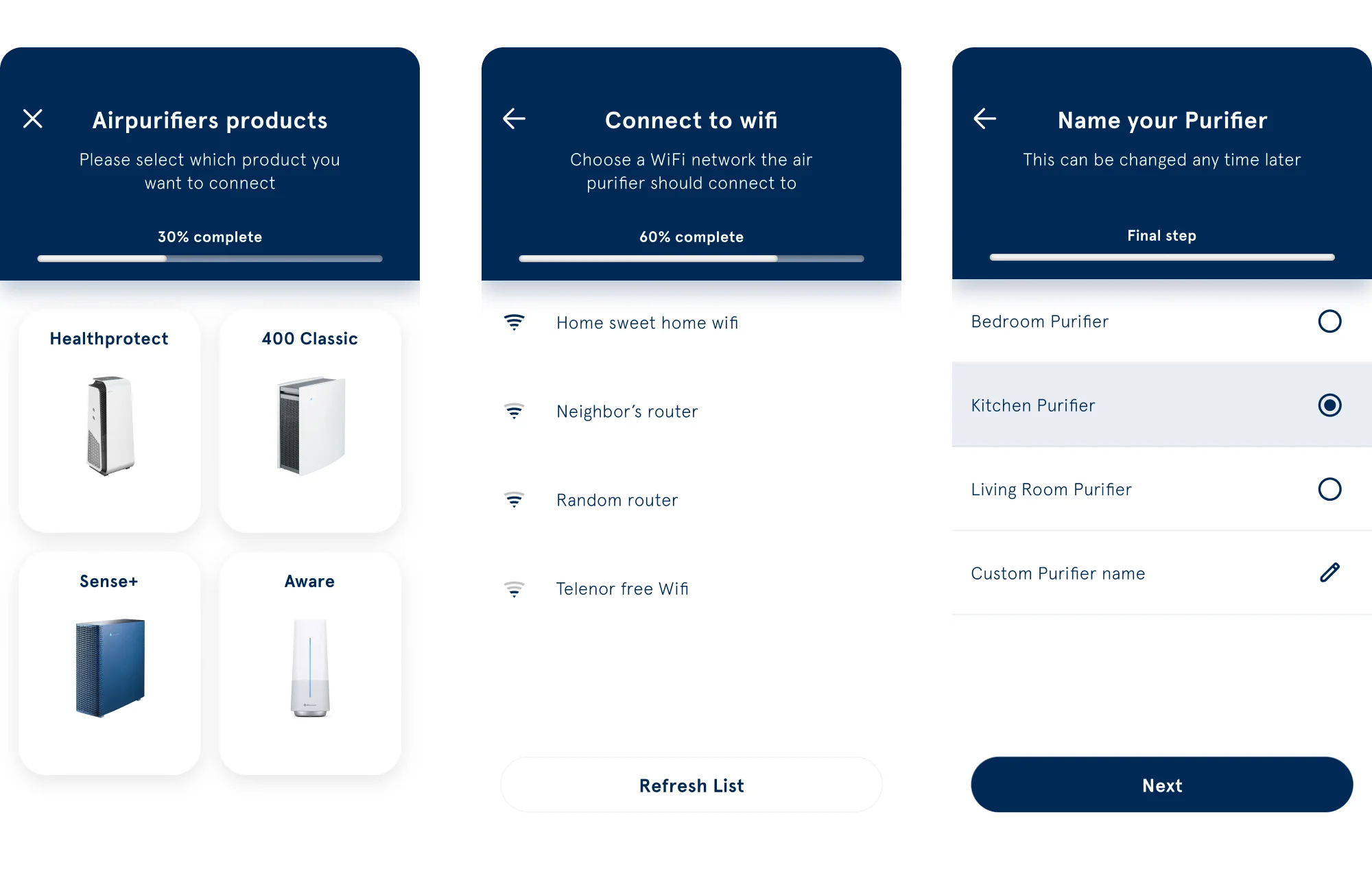
Pairing flow: choose your purifier, connect it to wifi and name it, with a percentage progress bar
01

Pairing: choose your device, then connect

The old flow asked people to match the blinking pattern on their purifier, and each model blinked differently. We flipped it: you first pick the purifier you own, then pair it. People could also connect before signing in, which made the device drop the connection later, so we fixed the order. Onboarding was long with no sense of progress, so we added a bar at the top. The steps change by device type, so it shows a percentage instead of a step count.
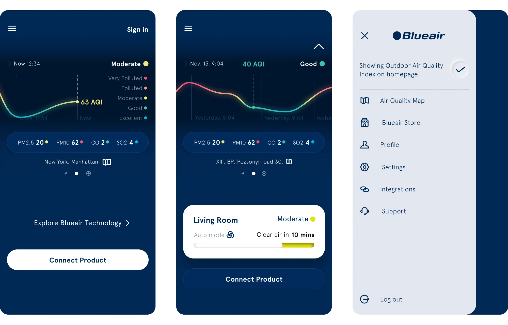
Home screen before and after connecting a purifier, and the new menu
02

Structure: everything where people look for it

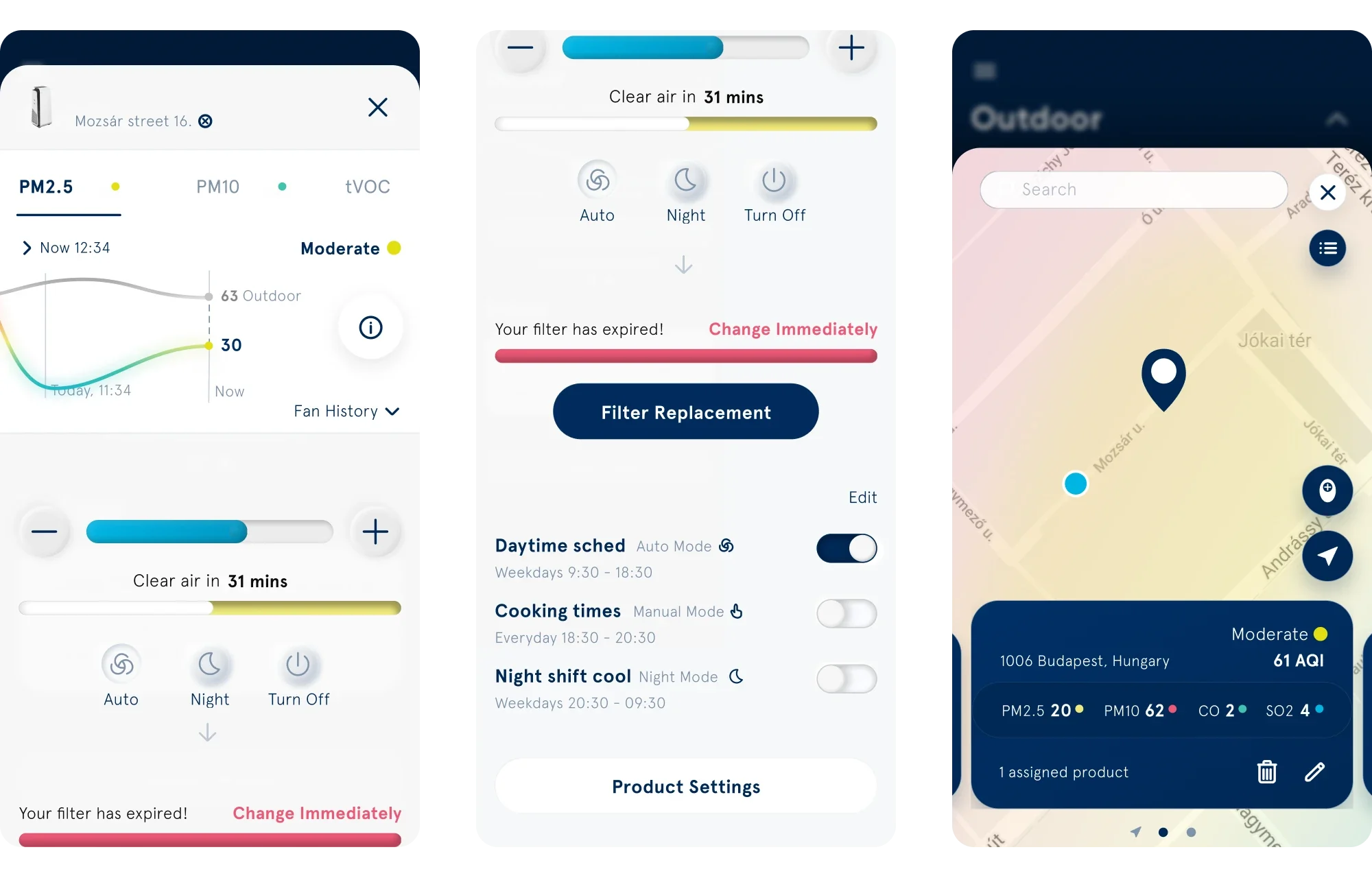
We rebuilt the whole app: onboarding, the product page, connected devices, the menu and navigation, filter change and tracking, the air quality map and the launch screen, with every variation. In tests we measured how long it took people to reach a goal, and they found what they were looking for 23% faster.

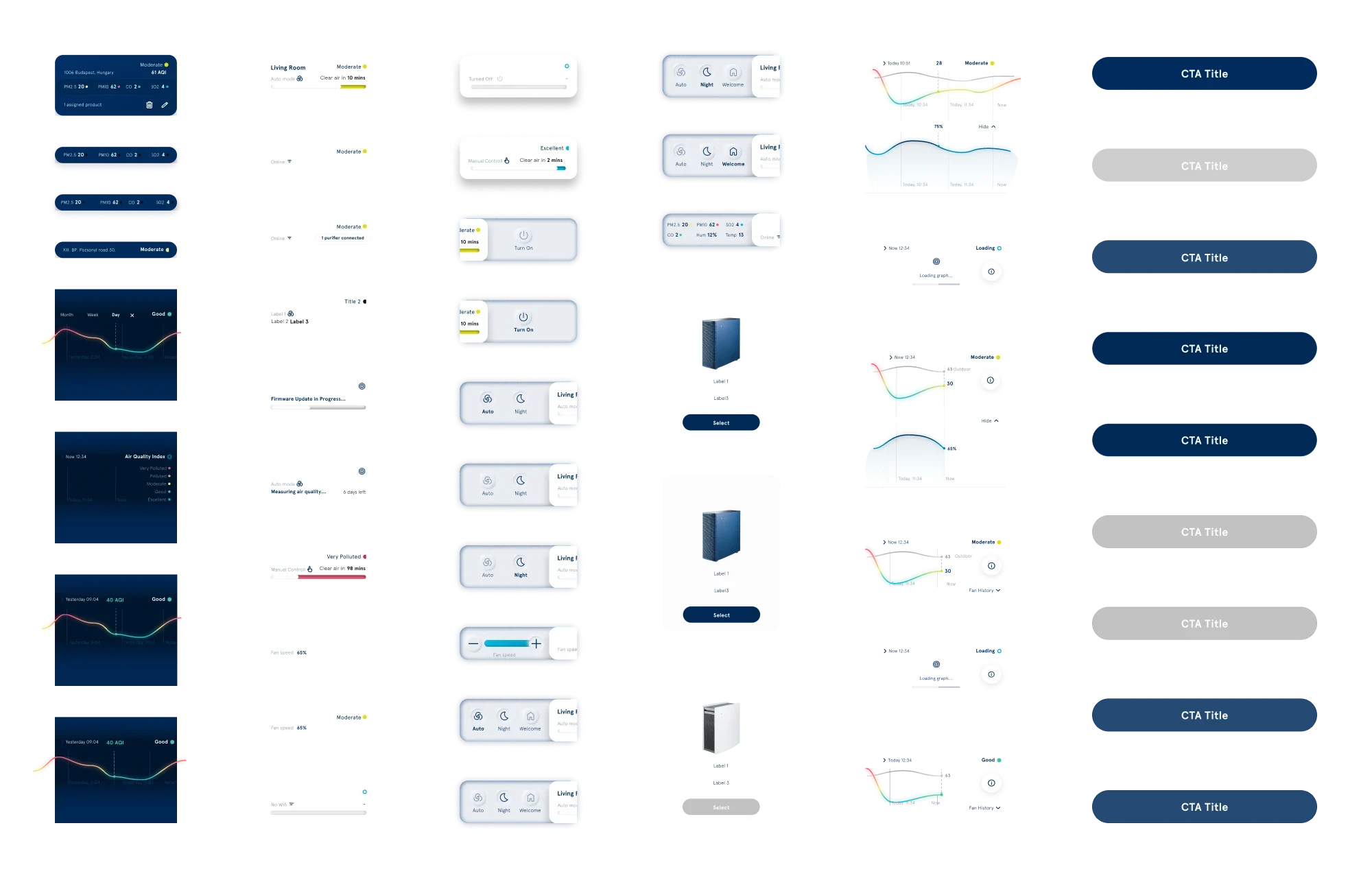
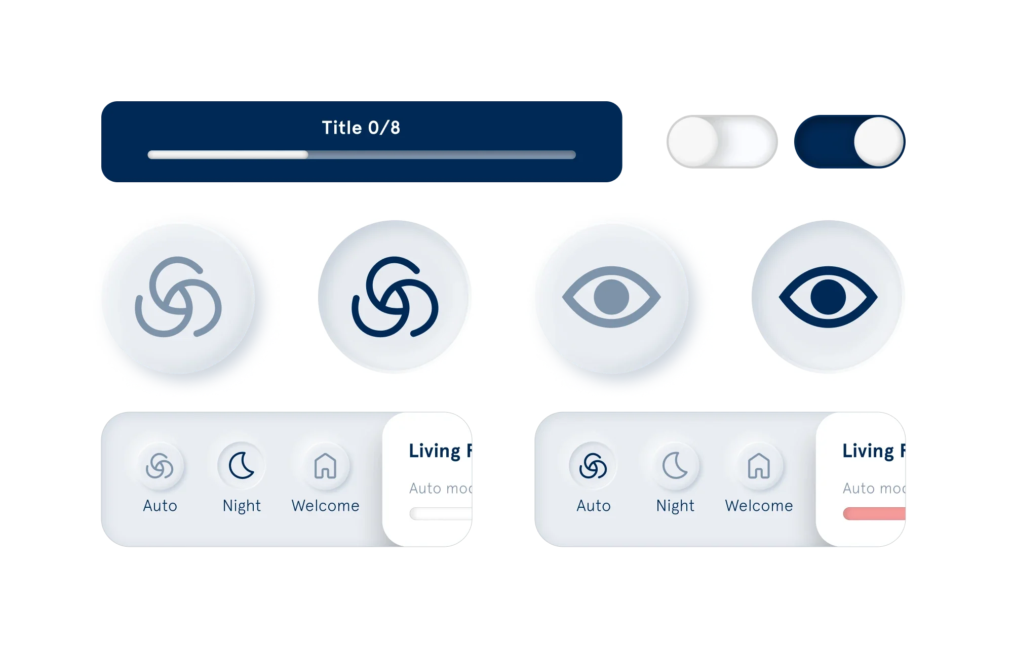
Neumorphic buttons, toggles and mode controls
03

Buttons that match the device

We wanted the app to feel connected to the purifier in the room, so the buttons use soft, neumorphic shapes. People can find the same button on the device and in the app.

Design system components: air quality cards, charts, controls, product picker and buttons
04

A design system for both platforms

We rebuilt Blueair's design system, with a custom design for iOS and for Android. It kept every screen consistent and gave us room to experiment with neumorphic elements.

Outcome

Ratings up from 3.0 to 4.5

At release, the app rose from 3.0 to 4.5 stars on the App Store and from 2.8 to 4.4 on Google Play. The client was really happy with how it turned out.

Product page with fan control, filter status and schedules, and the air quality map

Want the full story?

I can walk you through the decisions behind this work in a 30 minute call.

Book a call
Next case studyIncQuery Labs